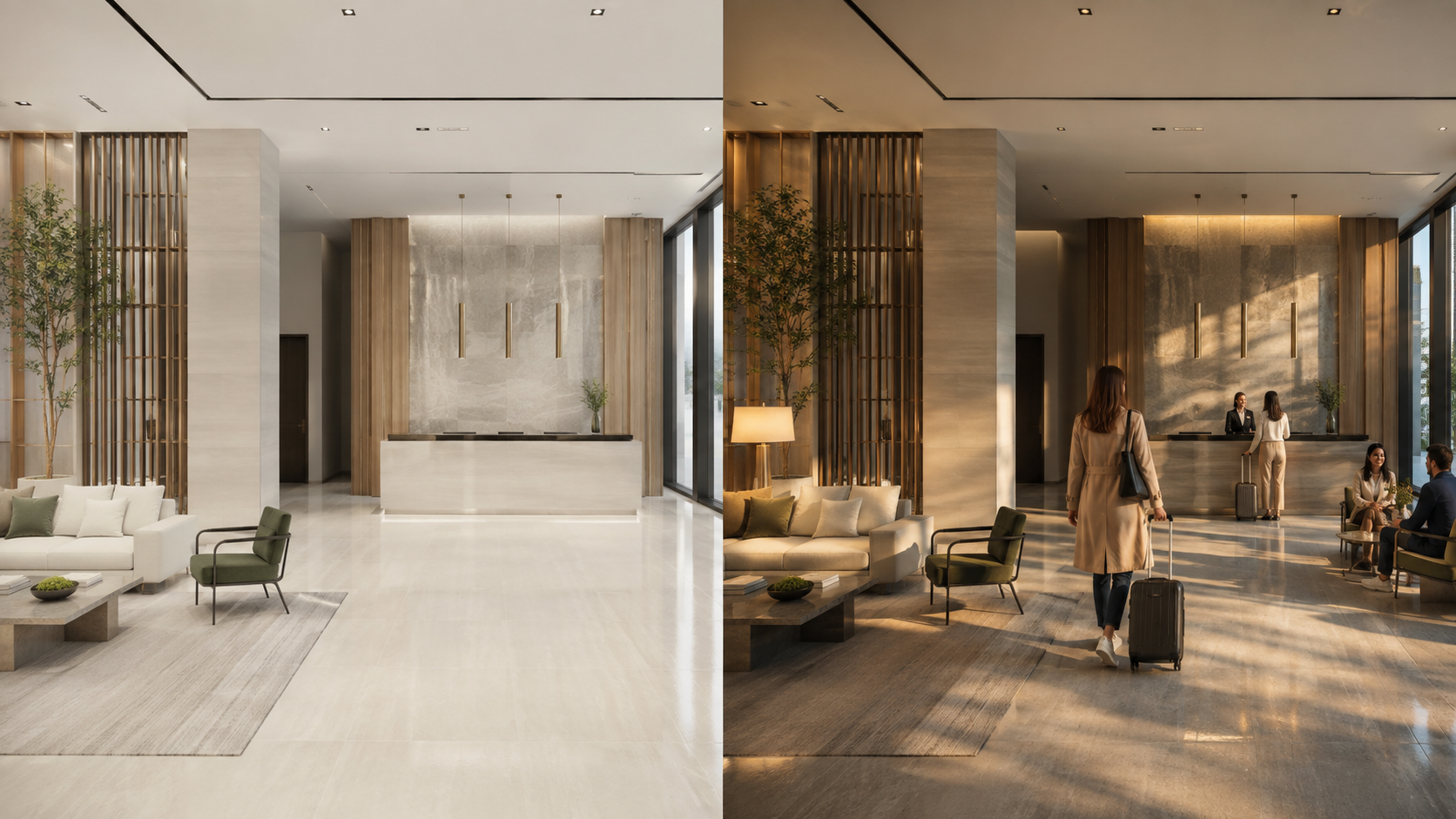
A realistic 3D visualization requires more than accurate furniture, clean geometry, expensive materials and technically correct lighting.
This is a common problem in architectural visualization.
The image may be polished, but it feels empty. The materials look new, the lighting feels uniform and every object appears carefully arranged. Nothing is obviously wrong, yet the viewer does not feel that the space has a life beyond the image.
The problem is usually not a lack of detail.
It is a lack of hierarchy, variation and human evidence.
1. How Material Variation Makes a Realistic 3D Visualization Feel Believable?
Real spaces contain controlled irregularity.
Floor reflections are not equally strong everywhere. Fabric does not respond to light like polished plastic. Timber, stone, metal and painted surfaces should not share the same level of sharpness, saturation or reflectivity.
When every material is equally clean and visually intense, the image starts to resemble a product catalogue or computer game.
The solution is not to make everything dirty. It is to introduce believable variation:
- Subtle differences in roughness
- Softer reflections away from the focal area
- Small changes in material response
- Natural transitions between new, touched and frequently used surfaces
These variations should support the design, not compete with it.
For the technical behaviour of reflection and roughness, refer to Chaos’s official VRayMtl documentation. However, believable material variation still depends on visual judgement and art direction.
2. The lighting explains the room but does not direct the viewer
Even a realistic 3D visualization can lose its impact when every part of the design is illuminated evenly.
That may satisfy documentation requirements, but it can weaken the image.
If the foreground, background, ceiling, furniture and decorative elements all receive similar visual emphasis, the viewer does not know where to look first.
A stronger image normally establishes three levels:
- The primary area that communicates the design idea
- Supporting areas that explain the space
- Quieter areas that provide depth and visual rest
This does not mean making the image excessively dark. It means controlling contrast locally rather than increasing contrast across the entire image.
3. Colour is present, but it has no discipline
Strong colours can establish identity, but their reflections can quickly overwhelm an interior.
For example, a red ceiling feature may produce red reflections across the floor, walls and furniture. Although this may be physically plausible, it can make a hospitality or commercial space feel like a nightclub.
Removing all reflected colour is also not the answer. That creates another kind of artificial image.
A more controlled approach is to keep the colour strongest near its source, then gradually reduce its influence across secondary surfaces. Neutral materials should still retain some environmental colour, but not so much that they lose their own identity.
The objective is controlled colour separation—not complete colour removal.
4. People are added as decoration instead of evidence
Adding people does not automatically create life.
If every person is walking, facing the camera or placed along the same line, the scene becomes staged. If people block the architecture or compete with the design, they reduce clarity rather than improve realism.
Human figures should help explain:
- Scale
- Circulation
- The purpose of the space
- How different zones are used
- Where attention and activity naturally occur
A family approaching a children’s attraction, someone waiting near an entrance or a person interacting with a display can communicate more than several random walking figures.
The activity must belong to the space.
5. The image shows objects but not consequences
A realistic 3D visualization contains evidence that objects affect their surroundings.
A chair should create contact shadows. A bright screen should influence nearby surfaces. Glass should reflect part of the environment. A person standing under a ceiling light should receive light from that direction.
Without these relationships, objects appear pasted into the scene.
This is often why simply adding AI-generated people or decorative items fails. The added elements may look realistic individually, but they do not participate in the same lighting, perspective and material environment.
Realism depends on relationships not isolated detail.
6. More sharpness is mistaken for more realism
Digital sharpening can make edges clearer, but it cannot repair weak material response, flat lighting or incorrect scale.
Excessive sharpening introduces bright edge halos, noisy textures and an artificial “processed” appearance. The image may look clearer at first glance but less photographic when inspected closely.
The correct sequence is:
Resolve lighting and material separation
Check scale and contact
Control local contrast
Apply restrained final sharpening
Sharpness should support information that already exists. It should not manufacture detail that the render failed to produce.
Professional judgment
When a client says a visualization is “not realistic enough” or “not lively enough,” adding more objects is rarely the best first response.
The more useful questions are:
- What should the viewer notice first?
- Which materials are competing for attention?
- Does the lighting create depth?
- Do people explain how the space is used?
- Are objects affecting one another convincingly?
- Is post-production improving the image or merely making it louder?
A successful architectural visualization does more than display a design.
It creates a believable visual argument: this space has scale, purpose, atmosphere and a reason for people to be there.
That is the difference between an image that is technically complete and one that helps a design team persuade a client.
Selected examples of this approach can be found in my 3D interior visualization portfolio.
I am interested in senior visualization opportunities where production efficiency, controlled art direction and clear design communication are equally valued.
A realistic 3D visualization is not defined by detail alone, but by believable relationships between lighting, materials, people and space.